- Introduction
- Setting up your account
- Balance
- Clusters
- Concept drift
- Coverage
- Datasets
- General fields
- Labels (predictions, confidence levels, label hierarchy, and label sentiment)
- Models
- Streams
- Model Rating
- Projects
- Precision
- Recall
- Annotated and unannotated messages
- Extraction Fields
- Sources
- Taxonomies
- Training
- True and false positive and negative predictions
- Validation
- Messages
- Access control and administration
- Manage sources and datasets
- Understanding the data structure and permissions
- Creating or deleting a data source in the GUI
- Preparing data for .CSV upload
- Uploading a CSV file into a source
- Creating a dataset
- Multilingual sources and datasets
- Enabling sentiment on a dataset
- Amending dataset settings
- Deleting a message
- Deleting a dataset
- Exporting a dataset
- Using Exchange integrations
- Model training and maintenance
- Understanding labels, general fields, and metadata
- Label hierarchy and best practices
- Comparing analytics and automation use cases
- Turning your objectives into labels
- Overview of the model training process
- Generative Annotation
- Dastaset status
- Model training and annotating best practice
- Training with label sentiment analysis enabled
- Understanding data requirements
- Train
- Introduction to Refine
- Precision and recall explained
- Precision and Recall
- How validation works
- Understanding and improving model performance
- Reasons for label low average precision
- Training using Check label and Missed label
- Training using Teach label (Refine)
- Training using Search (Refine)
- Understanding and increasing coverage
- Improving Balance and using Rebalance
- When to stop training your model
- Using general fields
- Generative extraction
- Using analytics and monitoring
- Automations and Communications Mining™
- Developer
- Uploading data
- Downloading data
- Exchange Integration with Azure service user
- Exchange Integration with Azure Application Authentication
- Exchange Integration with Azure Application Authentication and Graph
- Migration Guide: Exchange Web Services (EWS) to Microsoft Graph API
- Fetching data for Tableau with Python
- Elasticsearch integration
- General field extraction
- Self-hosted Exchange integration
- UiPath® Automation Framework
- UiPath® official activities
- How machines learn to understand words: a guide to embeddings in NLP
- Prompt-based learning with Transformers
- Efficient Transformers II: knowledge distillation & fine-tuning
- Efficient Transformers I: attention mechanisms
- Deep hierarchical unsupervised intent modelling: getting value without training data
- Fixing annotating bias with Communications Mining™
- Active learning: better ML models in less time
- It's all in the numbers - assessing model performance with metrics
- Why model validation is important
- Comparing Communications Mining™ and Google AutoML for conversational data intelligence
- Licensing
- FAQs and more

Communications Mining user guide
Filtering Reports
You can apply filters to enhance data insights in the Reports page.
The following sections explain the filters in Communications Mining™ and how to apply them. To learn how to leverage conversational filters, which is an Autopilot for Communications Mining feature, to turn a natural language query into the correct set of filters automatically, check the Autopilot for Communications Mining - Conversational filters page.
Applying filters in Reports
You must have assigned the Source - Read and Dataset - Read permissions as an Automation Cloud user, or the View sources and View labels permissions as a legacy user.
You can use the filter bar to manipulate the charts and update the summary statistics presented in the Reports page.
The filter bar and adding or removing filters
The filter bar works similarly to the one in the Explore page. The key difference is that in Reports, you can use thread filters for conversational datasets containing threads, including email threads, chats, and call transcripts. For more details on thread filters, check.
You can add multiple filters, including multiple metadata fields, in the Reports and Explore tabs, and that all of the filters will determine the messages in scope as shown by the summary statistics on the page.
When selecting which labels to appear in the label-specific charts, use the Charted labels dropdown menu on the Trends or Segments pages.
Label filter
The label filter bar in Reports works similarly to the one in the Explore page. For more information and a detailed explanation of the advanced prediction filters, check Advanced prediction filters.
The label filters do not determine which labels are actually plotted on the label-specific chart. This is determined by the Charted labels selector. For more details, check the following sections.
Threads filter
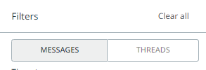
On the filter bar, you can toggle between Messages and Threads. This allows you to apply analytics at the level of conversations, instead of individual messages.
The threads filter is applicable for longer-form conversations like email threads, phone calls, and live chats. Once the Threads filter is selected, a fourth reports tab will become available, containing charts relating to thread properties and label volumes.
Attachment filter
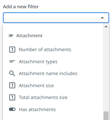
The attachment based properties are available for each message that supports attachments.
These properties include:
-
Has Attachment (Yes/No)
-
Number of attachments
-
Attachment Size (Mb)
-
Total Attachment Size (Mb)
-
Attachment Name Includes - Provides a fuzzy search capability
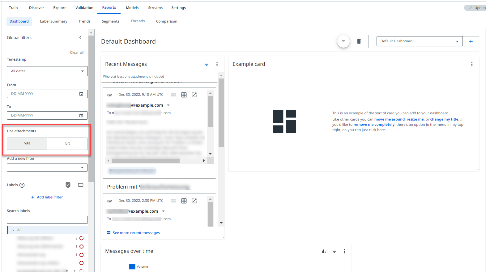
You can filter and run analytics on messages with specific attachment properties:
Time series filtering
You can filter the time series within Reports using the time series filter in the filter bar, or by selecting an area on a time series chart.
This will filter the messages in scope to only the select period, as well as adjust any time series charts to the filtered period.
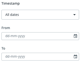
Using the time series filter in the filter bar works similarly as the one in the Explore page. Select the following filters: From or To, or both, or choose a preset custom range such as Last 7 days.
To select the area on a time series chart:
-
Select a chart that shows a trend over time
-
Highlight a time period on the chart by selecting your mouse at the start of the time period you want to filter and drag it to the point in time you want to finish on
-
This will filter the chart for the specific time period that you highlighted
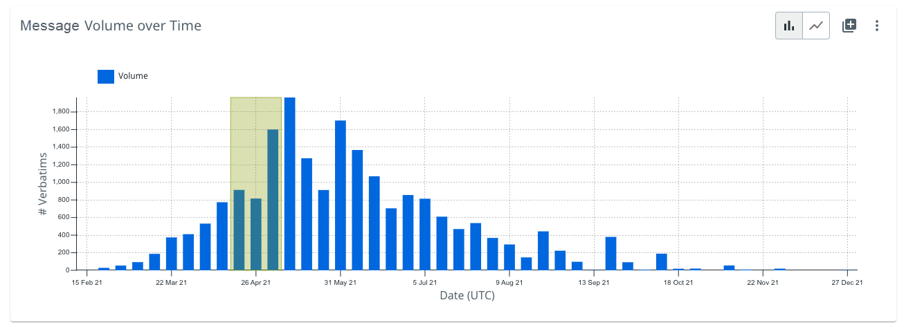
Once the chart refreshes, it shows the time period that you selected has automatically been applied to the timestamp in the filter bar. You can view the time period in the summary statistics.
Chart time sequence
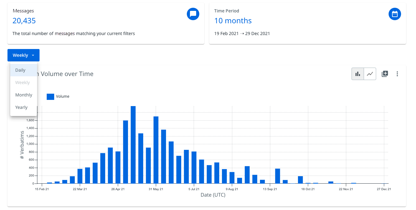
In the Trends tab, you can select which time sequence you want the time series charts to be displayed in using the dropdown menu as shown in the following image. This allows you to plot the time series charts as:
-
Daily
-
Weekly
-
Monthly
-
Yearly
Advanced prediction filters
Overview
Advanced prediction filters represent a significant step forward in how the label filters work in both the Explore and Reports pages in the platform.
The capability of the platform has expanded to support intelligent filter combinations on label predictions.
When filtering by label predictions you can:
- Apply multiple label filters at once, in both Explore and Reports.
- Filter for messages that have one of a number of selected labels predicted, that is, Label X OR Label Y OR so on.
- Filter for messages that have multiple different labels predicted, that is, Label X AND Label Y AND so on.
- Filter for messages that do not have certain labels predicted, that is, NOT Label Y.
- Search for messages containing specific search terms, while having label filters applied.
Essentially, the new filters allow you to apply any combination of AND, OR, and NOT filters when applying more than one label filter. These filters can give you much greater flexibility when training and interpreting your data, and can provide much deeper insights on happens in your communication channels.
Impact on model training and filtering charts
This section contains details on the way you select a label to sort by when training in Explore, and how you select labels to appear in the charts in Reports.
When you filter to a label in Explore, this no longer determines the training mode or the sort order of the current training mode. Instead, this is determined by a taxonomy dropdown menu that appears when you select a training mode that is specific to a certain label, such as Check label or Missed label.
This allows you to sort by a certain label for a training mode and have an additional label filter applied.
How this works in practice is covered in the following sections.
Similarly, when you filter to labels in Reports this no longer determines which labels appear in charts. Instead, this also acts exclusively as a filter and the dropdown Charted labels menu determine which labels are shown in the charts. How this works in practice is also discussed in more detail at the end of this article.
Applying advanced prediction filters
There are now two ways to apply label filters, and they can be used in combination with each other to create the right type of query.
Taxonomy Bar
The taxonomy of labels functions as a normal filter bar, and allows you to select multiple labels at once with a single select for each.
Selecting multiple labels from the taxonomy creates an OR type query.
If you selected Label A, Label B, and Label C in the taxonomy, this creates the following query: Show me messages with Label A, Label B, or Label C predicted.
The following example would return messages that contained at least one of the three selected labels:

Add Label Filter
The second filter option is the + Add Label Filter button.
This enables a dropdown taxonomy that allows you to select more complex filters, including or excluding certain labels from consideration.
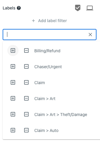
From this dropdown menu, you can select multiple labels that you want to include or exclude, by selecting the plus or minus buttons.
The result would be something like the following example, which would return messages predicted to have the label Billing or Refund, but that also do not have the label Chaser or Urgent predicted:
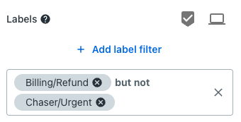
You can select + Add Label Filter multiple times to add additional layers to your query. Two separate label filters create an AND type query, while multiple labels selected in the same label filter create an OR type query.
In the example below, multiple label filters have been applied individually. This creates a filter that will return messages predicted to have either of the two labels in the first filter, but that also have the Policy label predicted, and do not have the Quote label predicted.

A helpful tip is that by selecting the ampersand & sign in an individual filter containing multiple labels, you can automatically split them out into individual filters. This would change the query from OR, that ism any of these labels predicted, to AND, that is, all of these labels predicted.
Combining taxonomy bar filters and added label filters
You can combine filters from both the taxonomy bar, and individually added label filters. Filters applied in the taxonomy bar are treated as an AND query with any individually applied label filters.
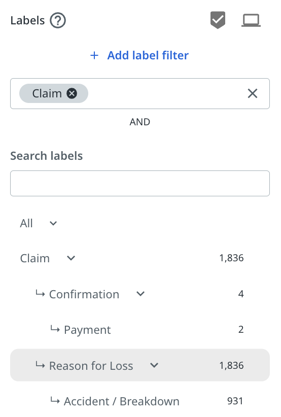
Combining label filters and sorting by label for training
What these new filters also mean, is that you can now apply label filters and sort by a specific label for a training mode.
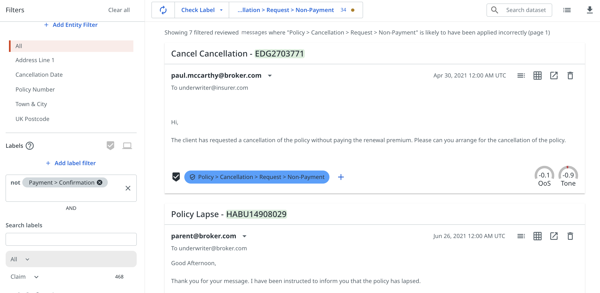
Sorting by label for training modes in Explore
To enable the advanced prediction filters, a number of other updates have been made that do change the way you select labels to train in Explore. Overall, these changes make the platform more consistent across the platform, as well as providing greater capabilities to run detailed queries on your data.
You can find the selected training mode and sort order in Explore as shown in the following image.
Instead of using the filter bar when selecting a specific label to train, select the training mode first. A taxonomy dropdown then prompts you to select the label you wish to sort by.
The following example shows a user having selected Check Label and then being prompted to select which label to sort by:
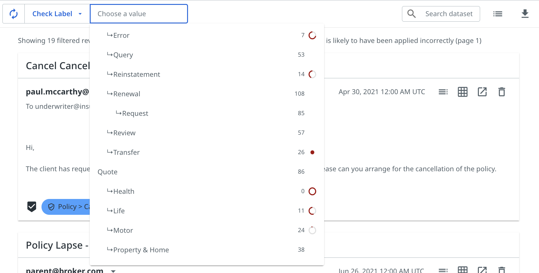
The page also shows that the pinned label counts, red dial indicators, and any performance warnings for a label are also displayed in the taxonomy dropdown, giving you all the information you need to select the right label to sort by.
Once a label is selected, it will show next to the training mode alongside the number of pinned examples and any performance warning indicators.
Now, if you select a label from the label filter bar, the platform will prompt you to select it from the sort order dropdown menu if you intend to train the selected label:
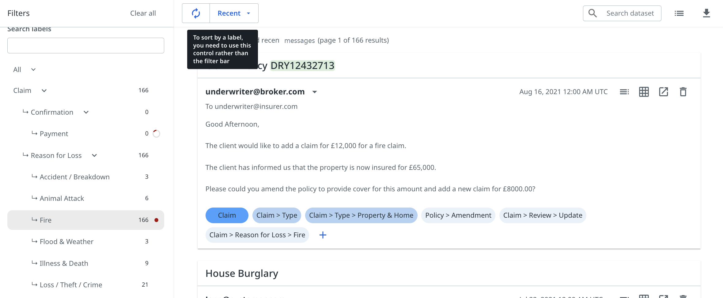
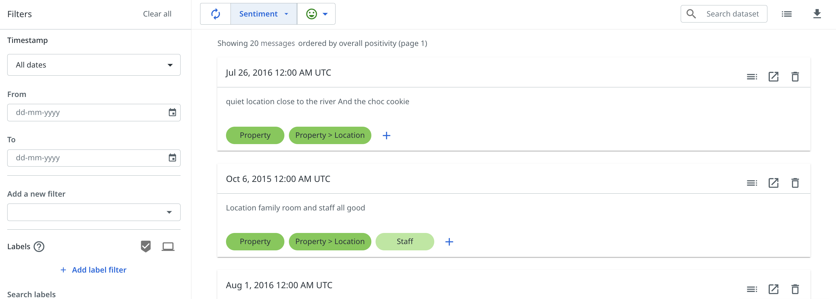
You can see a specific mode in Explore, Sentiment, to sort by positive or negative sentiment only as shown in the following image. If you want to sort by label and sentiment, you can still do that using the Label sort order and adding a sentiment filter:
Selecting labels to appear in charts in Reports
The label filters act exclusively as filters to update the messages that are in consideration, similar to any other user property filter, by including or removing messages that have or do not have certain labels predicted.
To select which labels actually appear in the charts in the Reports page, there is now a Charted labels dropdown menu in the top bar.
Simply select whichever combination of labels you want to appear and these will be plotted on the charts which distinguish between different labels, as in the example below.
Remember, this does not change the messages that are in consideration by the platform, merely which labels are plotted on the label specific charts. An easy way to remind yourself of this is to note that the total number of messages shown at the top of the page does not change when you select any labels from the Charted labels dropdown.

All of the labels that you select will appear highlighted at the top of the page as a visual reminder, and can easily be removed by selecting the X button next to each label name.
Charting specific labels and property values
You must have assigned the Source - Read and Dataset - Read permissions as an Automation Cloud user, or the View sources and View labels permissions as a legacy user.
Charting specific labels
You can find the Chart labels dropdown option in the Label Summary, Trends, Segments, Threads, and Comparison tabs. Use this dropdown to select which labels appear or do not appear in the charts in the Reports page.
Select whichever combination of labels you want to appear selecting the plus + icon, and these will be shown on the charts that distinguish between different labels, as shown in the following image. Alternatively, you can select labels you do not want to appear by selecting the exclude button, that is, the minus - icon.
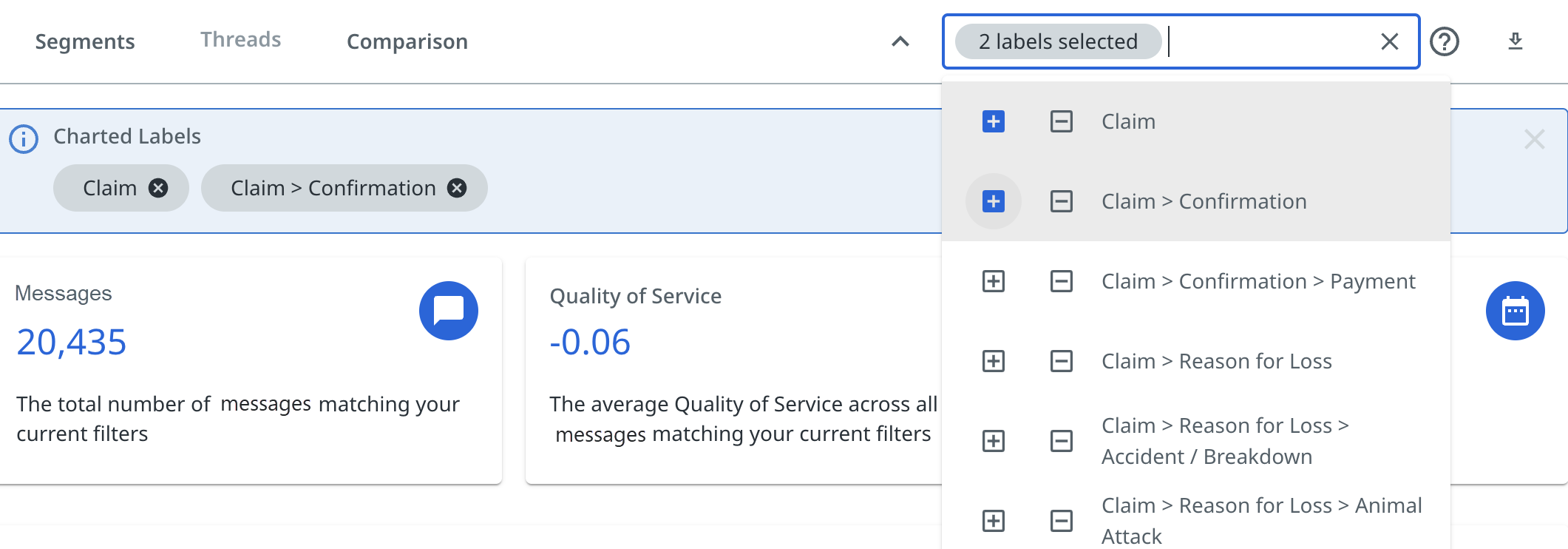
If you select a number of labels, they will appear in a bar at the top of the page as a visual indicator of which labels have been selected to appear on the charts.
All of the labels that you select or exclude will appear highlighted at the top of the page as a visual reminder, and can easily be removed by selecting the X icon next to each label name.
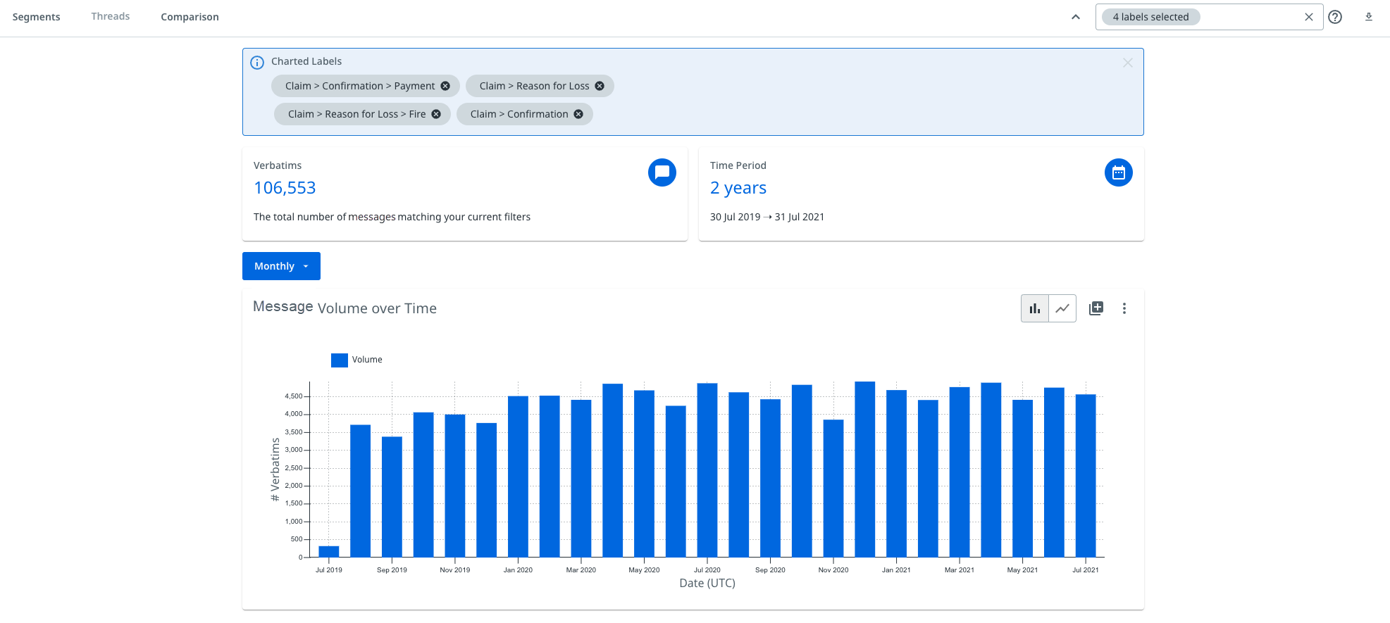
- This action does not change the messages that are in consideration by the platform, merely which labels are displayed on the label specific charts.
- The total number of messages shown at the top of the page does not change when you select any labels from the Charted labels dropdown.
Chart specific property values
In Segments, much like you can choose to chart labels as previously shown, you can also chart specific string property values.
You can select a number of property values you wish to display on the chart, and this will override the default values shown, which are typically the property values that have the highest corresponding message volumes.
In the following example, the email property of Sender Domain is shown. Using the dropdown from the chart, you can select a number values to display instead of the default ones shown.
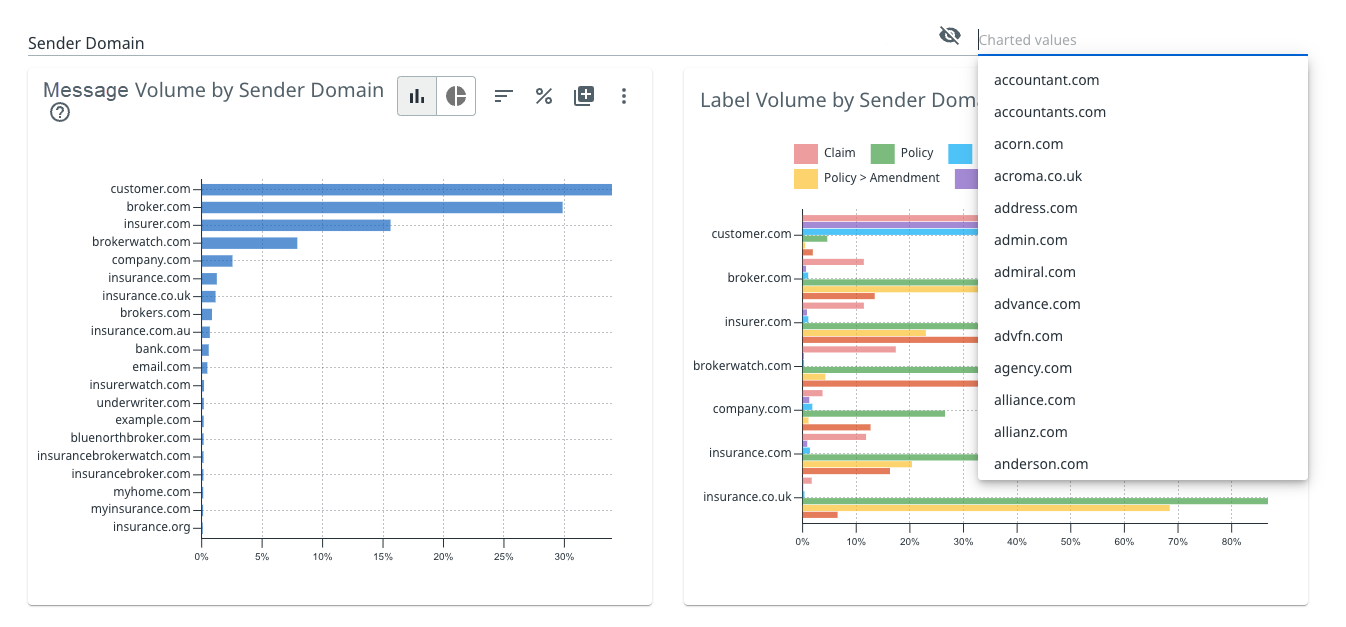
Chart buttons
You must have assigned the Source - Read and Dataset - Read permissions as an Automation Cloud user, or the View sources and View labels permissions as a legacy user.
The following button are displayed on each chart when you hover over it with your mouse. These buttons allow you to change the chart view and are tailored to each graph.
The buttons available change depending on the exact chart type. They are a reflection of the current view shown in the chart, and so in some instances selecting them will change the mode to an alternative view, and the button displayed will also update.
The following table describes the chart manipulation buttons:
 | Add this chart to your dashboard. |
 | Option to download an image of the chart, download the raw data for the chart as CSV, or add chart to your dashboard. |
 | Show percentages. |
 | Show totals. |
 | Display as column or bar chart. |
 | Display as line chart. |
 | Display as scatter graph. |
 | Display as doughnut chart. |
 | Sort by prominence. |
 | Sort alphabetically. |
 | Sort reverse alphabetically. |
 | View labels with the biggest changes in rank. |
 | Change the number of labels displayed. |
- Applying filters in Reports
- The filter bar and adding or removing filters
- Label filter
- Threads filter
- Attachment filter
- Time series filtering
- Chart time sequence
- Advanced prediction filters
- Overview
- Impact on model training and filtering charts
- Applying advanced prediction filters
- Sorting by label for training modes in Explore
- Selecting labels to appear in charts in Reports
- Charting specific labels and property values
- Charting specific labels
- Chart specific property values
- Chart buttons